相关案例
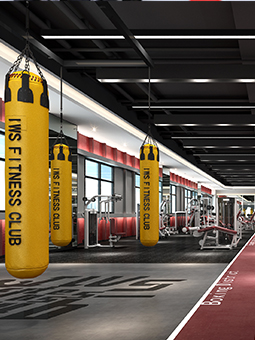
行业:健身房,俱乐部,游泳馆,拳击格斗馆
品牌:临汾冰世界游泳健身俱乐部
服务:健身场馆空间装饰装修设计,品牌策划,软装陈列设计,健身场馆灯光设计
说明: 临汾位于山西省西南部,历史悠久,是华夏民族的重要发祥地之一和黄河文明的摇篮,有“华夏第一都”之称。...
行业:医疗器材、医疗设计生产研发
品牌:东莞蓝海皓净化科技有限公司
服务:品牌形象设计,医疗VI设计,医疗标志设计
说明: 东莞蓝海皓净化科技有限公司是从事医院洁净手术室配套产品及中心供应室、医疗家具、医药净化设备的设计、...
行业:企业形象视觉识别系统
品牌:品深设计
服务:商城vi系统设计,品牌标志设计,企业品牌策划
说明: 企业视觉形象识别,是指在企业经营理念的指导下,利用平面设计等手法将企业的内在气质和市场定位视觉化、...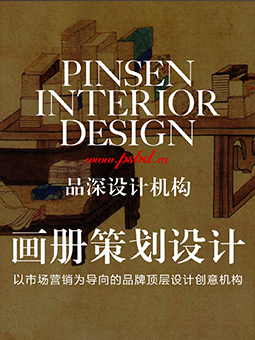
行业:集团/企业/上市公司画册设计
品牌:品深设计
服务:深圳画册设计、企业品牌文化梳理、文案策划、商业摄影
说明: 现在所有的平面的平面设计几乎有用到版式,大到一本画册,一个海报,一个广告牌,小到一个提案...
行业:餐饮品牌策划
品牌:品深设计
服务:餐饮品牌策划、餐饮VI系统设计、餐饮品牌手册、餐饮品牌宣传资料
说明: 餐饮品牌策划就是对餐饮品牌文化整合与提炼。就是对餐饮品牌的文化进行立意、策划、规划、设计,就是要站...
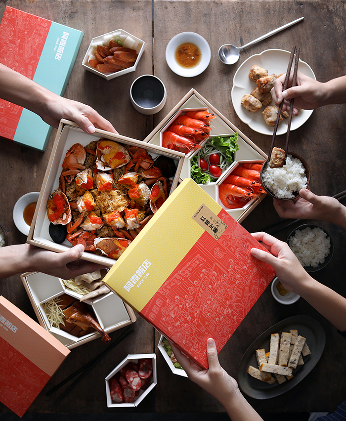
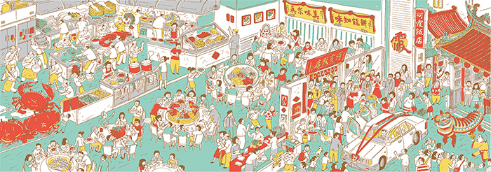
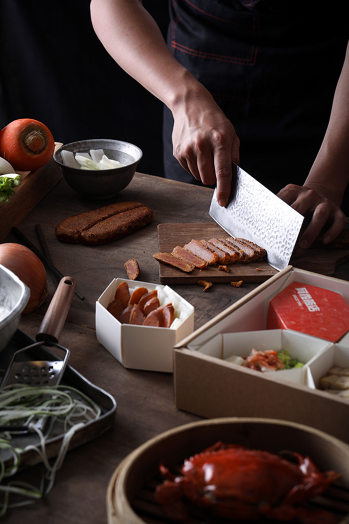
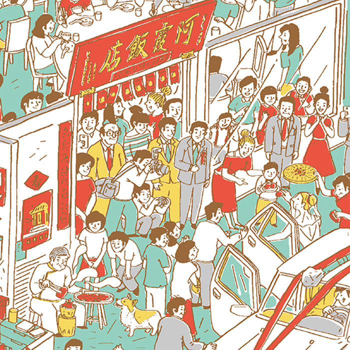
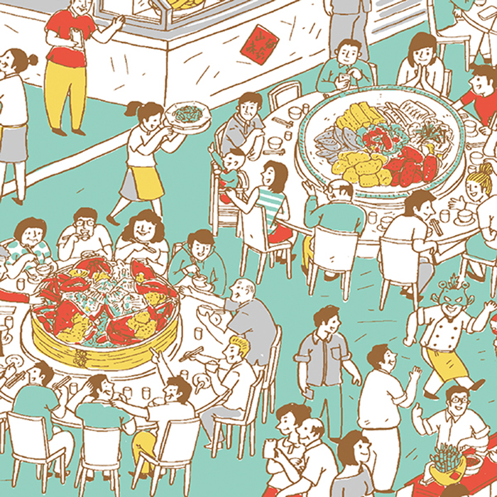
台湾阿霞滋味餐饮品牌设计
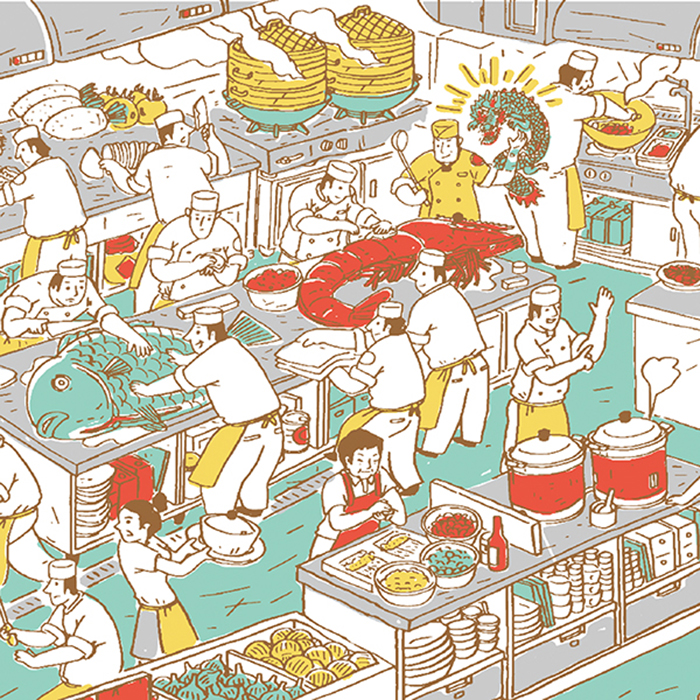
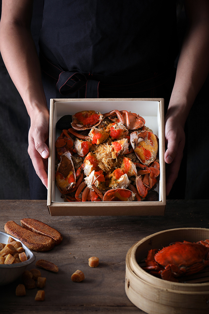
從1940 開始,位於台南巷 間的阿霞飯店( 稱錦霞 ), 今仍然是 聲鼎沸,無論是遠近馳 名紅蟳米糕,或是炭烤烏魚子…等, 道道打著「美味求真」的硬功夫臺菜,是每 位老饕共同的記憶。
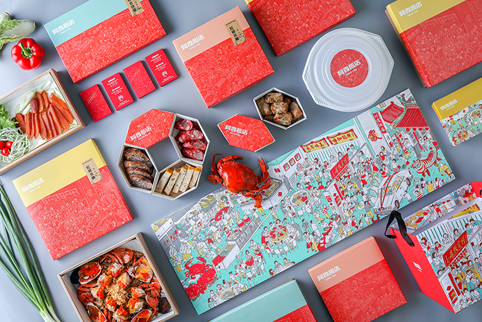
此次是針對阿霞飯店對外的年菜及外帶包裝,進行包裝梳 及視覺整合的設計企劃。視覺上以新穎的繪畫及色彩,紀錄臺南人從結婚迎娶至三代同聚於阿霞用餐的美好畫面,以及在廚房裡料理食材的廚師們,用鮮美的菜色與親切的笑容迎接一桌又一桌的饕客。
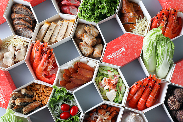
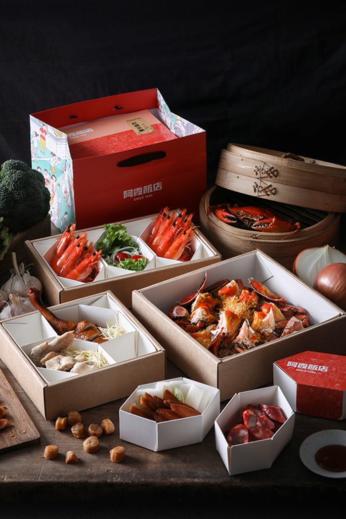
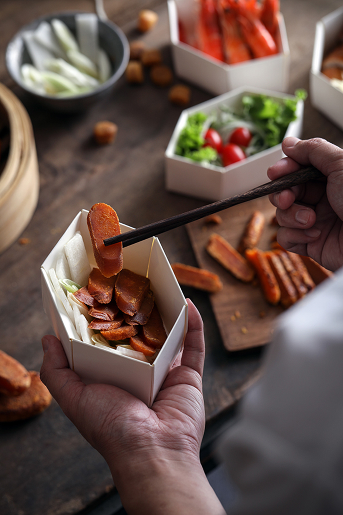
外帶包裝設計也因應臺菜拼盤及多樣化的菜色,以窗花結構為發想,六角形的小餐盒為單位,搭配三款大中小的矩形餐盒,對應不同節慶,能自由組合出多種擺盤形式。LOGO保留著阿霞飯店從1940 代開始,就使用的手寫字體,並以店內代表性的紅色加強整體系列性及辨識度,也為地方傳統老字號的名店帶來新的氣象及活力。
he Taste of Tainan A-Sha /
Packaging designs and visual coordination
Started in 1940 and hidden in the back alley of Tainan, the A-Sha restaurant, also known as JINXIA, is still in a hubbub of voices. Every single delicious genuine Taiwanese cuisine, such as the resounding Steamed Fresh Crab Roe on Glutinous Rice and the Charbroiling Mullet Roe all represents the memory of all the foodies.
This project planning is aiming at brand packaging and visual coordination. In terms of the visual coordination, we use new types of colors and drawings to depict the wonderful time when people in Tainan gathering at the A-Sha restaurant from the wedding day till the three generations enjoy together. This beautiful memory and drawings also record the moment when chiefs offering their guests one after another with delicious dishes and warm smiles.
The design of takeaway packaging is origin from the “window blossom,” reacting to the various Taiwanese cuisine and food platters, appearing in a Hexagon shape with large, medium and small sizes, allowing you to mix and match diverse garnishing and food presentation with different season.
The design of A-Sha logo remains the handwriting typeface that has been in use ever since 1940. While we use the representative color, red, to integrate the product series and to enhance its recognizability, this traditional brand is invigorated by the refreshing atmosphere and vitality.